This weekend I was busy trying to create my much anticipated 'reverse graffiti' piece for my big exhibition coming up on the 7th December 2010 in Belfast. First, I made a stencil of each letter of the word, cut it out and measured to scale for the backing boards to be made. The typeface 'Rockwell' was suggested as it is big, bold and would have a fun serif to experiment with.
THE MAKING OF THE BOARDS...

 After I measured out each letter by its height and width I decided to make four pieces of board to put two letters of the word treasure onto each of them. *It was handy that their was 8 letters in the word to do this* Each letter width was alittle different but they tallied up to: - 24" in height
- 25" in width
After I measured out each letter by its height and width I decided to make four pieces of board to put two letters of the word treasure onto each of them. *It was handy that their was 8 letters in the word to do this* Each letter width was alittle different but they tallied up to: - 24" in height
- 25" in width
Therefore, altogether the final piece as a whole will be 24" in height and 178" in width.....This will be close to 15 FEET!!!!
This process was NOT fun to make in minus temperatures but was well worth it in the end.


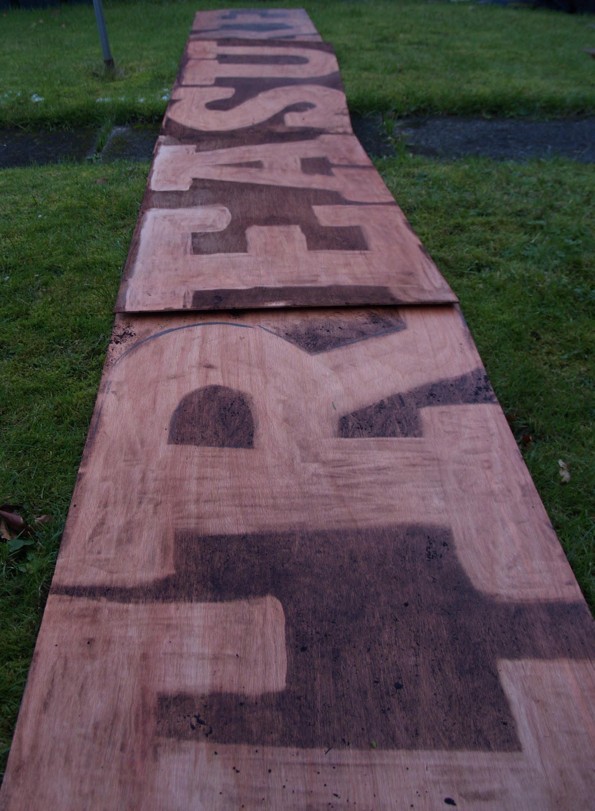
So, this is the next step I took to make the 'reverse graffiti' technique. I stuck down each letter as I'd planned and photographed each board to make sure they measured as I had hoped!! RESULT!!!
THE NEXT DAY!!!!
OKAY, so my plans didn't go as straight-forward as i had hoped!! The boards I had initially cut up didn't work well with the power hose and some couldn't even get 'clean' enough to see the letter I had stencilled!!
I had to resort to Plan B and use the boards I had cut up which were less dirty! >>>>
After having to fight with the hose, soaking me with water and battling through minus temperatures AGAIN!!! ....I finally received the results I had hoped for!! I am pleasantly surprised at how accurate the power-hose let me draw the letters as straight as they came out......the practice with those first boards and my freehand 'Reuse' design a few weeks ago really paid off!
 |
| THE POWER HOSE I USED |
 |
| THE VERY ACCURATE POWER GUN IN QUESTION :) |